Deception patterns use visual design to distract from relevant information or to frustrate the usual expectations of user interface design. They abuse proven or "good" design patterns to mislead users into unintended paths.
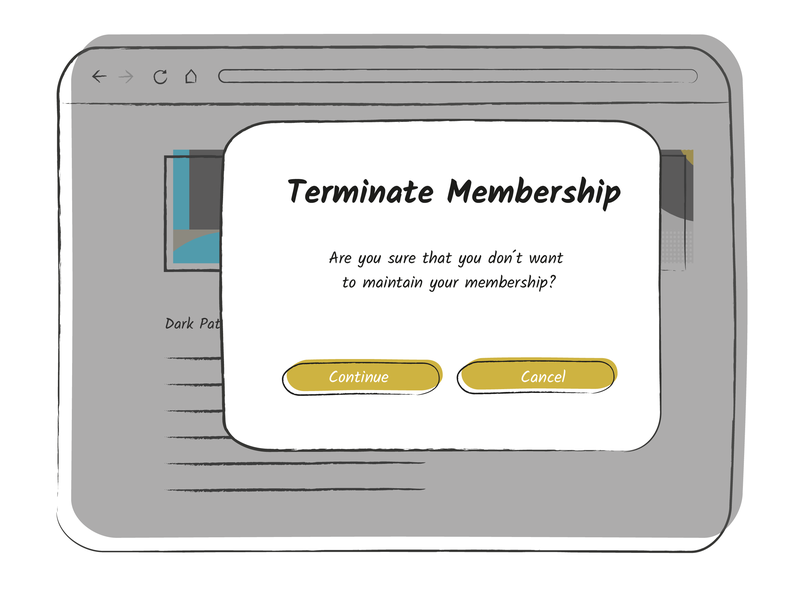
Confusingly formulated questions, e.g. double negatives or ambiguous wording, lead to users not being able to recognize the meaning of the choices with certainty. In the example, it is unclear to the user whether the membership can be terminated by "continue" or "cancel".


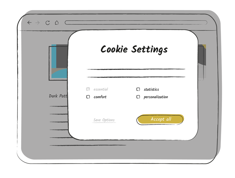
The misdirection dark pattern distracts from the content with flashy visual elements. In this example, the user is inclined to accept all cookies due to the yellow signal color.
The Bait and Switch dark pattern produces a different result than usually expected from a certain action. Typically, clicking on the cross in the upper right corner closes the window. In this case, the button triggered the automatic installation of an update.

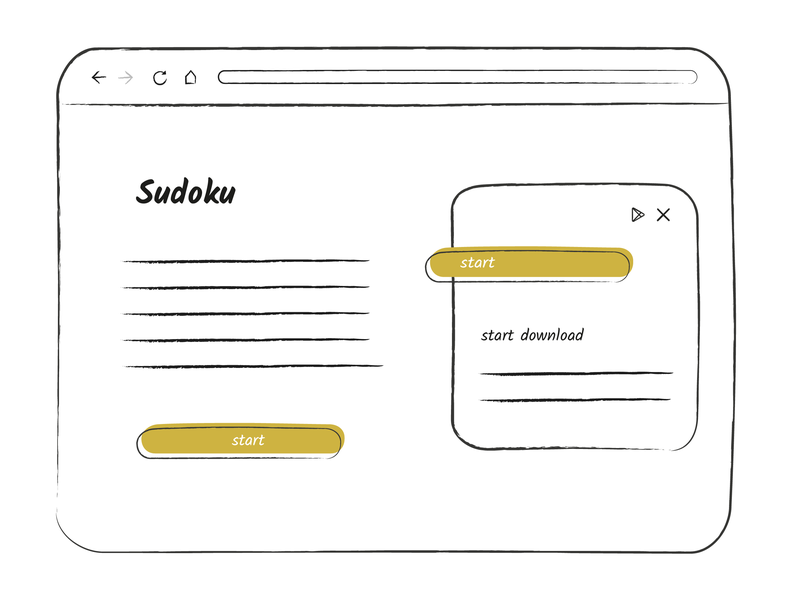
The Disguised Ads dark pattern masks advertising as content or control element so that users can interact with it. In this example, the box on the right is an ad. However, due to the yellow start button and the uniform design, the advertising looks like part of the game and is therefore easily clicked on unintentionally.